Gallery Walls
What’s not to love about a gallery wall? It is the ideal place to put on display the art you’ve collected, alongside family photos and momentos. Your gallery wall will inject character, warmth and personality to any wall in your home. It will also prompt interesting conversations.
But there is much more to putting together a gallery wall than just selecting some pieces of artwork that happen to blend together. You need to assess the sizes to make sure they fit right, and be sure the frames go together.
The main stumbling point is trying to figure out where to begin. Which scenario fits your situation: You have a bunch of art and you need to determine what fits on your wall, or you have a blank wall that needs some art?
Keep in mind that putting together a gallery wall is not an exact science. Your gallery wall will be unique as it represents your specific life experiences. One rule of thumb for a gallery wall is to make it personal.
Tips for Creating the Perfect Gallery Wall
Identify Your Gallery Style
What type of style are you wanting to showcase for your gallery wall? Do you want a streamline gallery wall with artwork that is coordinated or would you rather opt for an eclectic vibe?
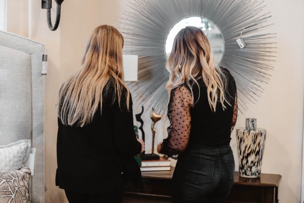
You might consider varying your art styles to put forth a dynamic gallery wall. Mix various styles of art and photography. This provides your wall with depth and allows each piece to shine without detracting from each other.
Utilize various types of art in your different styles, including photographs, abstract pieces, line drawings, for example.
Mix Up Your Frame & Matte
You might want to include an assortment of types of frames with different colors and finishes. You should have the variety restricted to a max of three different colors and finishes. You are aiming for an eclectic look while also having an informally curated gallery wall. By doing this, your art will look like it belongs together and has a cohesive theme.
Further add variety to your gallery wall by experimenting with different sizes of matting. Some art could have a thick matte, while others might have an average size. Still other art may not have a matte whatsoever. The goal is to leverage the matte to add striking visual interest to your gallery wall.
We recommend adhering to a shade of white with your matte to achieve a classic and cohesive look.
Change Up Sizes and Orientations
When you are laying out your design, try switching up the shapes, sizes and orientations of your frames.
Gallery walls tend to be most striking when they showcase pieces of all different sizes. Choose one to three larger pieces and fill the rest in with small and medium-sized art. Also, don’t select all vertical or all horizontal pieces. Be sure to mix it up.
Carefully Choose Your Color Palette
In order to achieve a cohesive look to your gallery wall, incorporate a variety of mixed media, such as sketches, prints, watercolor, and posters. This varied appearance will effectively help you pull off an eclectic style. But what is important is that all your pieces remain in the same color palette.
Think of it this way: each piece of art brings its own style and personality to your gallery wall. Although the art does not have to match, it is best to have it blend together and make sense.
Make Sure It’s Personal
Be bold as you include family photos, letters from a loved one, kid art, momentos from a favorite uncle or grandparent. Select artwork that represents the innate qualities and personal characteristics of family members and relatives. Choose photos that capture treasured family times together.
Include drawings that your kids have made, photos that celebrate milestone events in your family’s life, and quirky paintings that a child did. This is the perfect way to ensure your gallery wall is personal and exudes personality.
Choose an Anchor for Artwork
Your anchor piece is what makes the biggest statement and what you want to draw the eye to. In many cases, it will be your largest piece on your gallery wall. After you settle on your anchor piece, you can begin adding in your other pieces around it.
Laying Out Your Art
Place your largest piece, or multiple large pieces, of art initially, Usually, you will want to place these anchor pieces off-center rather than directly in the middle. Afterward, you begin to fill in around the larger pieces with the smaller art and photographs.
There is an exception to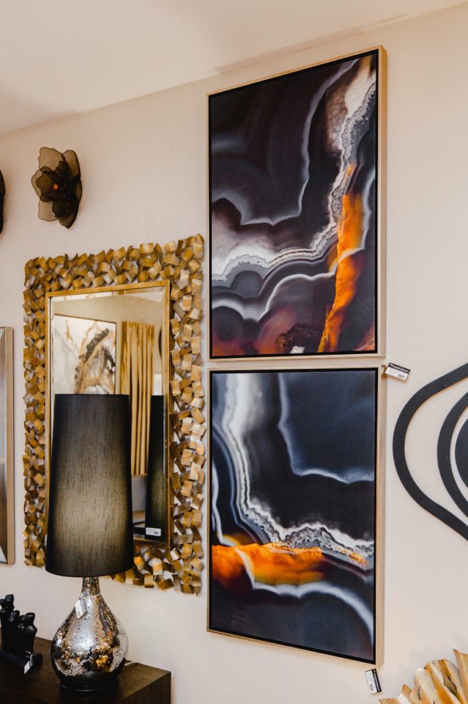
Mix up your vertical and horizontal pieces. The goal is ensuring you have spaced out and varied your art’s orientations. Don’t have too many pieces of one orientation beside each other.
Spread out pieces of similar colors, sizes, or art styles. You want both art styles and art pieces with similar color palettes to not be clustered together, so you keep your eye moving throughout the wall.
Also, space them out throughout the wall. If you happen to have several pieces that are the same size and they look nice beside each other, you could frame those next to each other and create a mini triptych or grid within your gallery wall.
As you did with your art pieces, you will want to mix up your frame styles throughout your gallery wall. For example, you don’t want all your metal frames clustered together. Attempt to have no more than two of the same frame color/finish next to each other.
Don’t Stress the Spacing
Don’t be concerned about spacing between each of your pieces. Your gallery wall might actually look better if your art is not spaced equally from one another. Having some variation in spaces makes it considerably easier to create a gallery wall.
If you do have an unintended awkward gap, you could add a dimensional object, such as a ceramic wall charm or embroidery hoop. You should also be comfortable with a little bit of negative space within your gallery wall.
Use Butcher Paper
Cut out the shapes and sizes of your art on butcher paper and proceed to tape those pieces in the same configuration you have on the floor to the wall. This is ideal for determining where nails will be needed, and it is also the first time you will see your gallery on the wall in its totality. Doing this enables you to make sure everything fits well, and you can still make necessary adjustments.
Measure Twice, Nail Once
Take note of exactly where the nail needs to go on each frame or piece of artwork. Then measure and place the nail accordingly on the wall. This could save you from the frustrating experience of attempting to hang a piece of art and then seeing a wire in the back. This tip will also prevent those extra holes from being made in your wall.
Spencer Carlson – Helping You Design Your Dream
From furniture to window treatments, artwork, and accessories, Spencer Carlson Furniture & Design is the only place in the Tri-Cities area where top-quality products are combined with passion and designer knowledge to transform your home into a stylish, customized environment!
Our designers will work with you to develop a new direction for your home or room design. We work with you throughout the entire design process, from conceptual design to implementation.
Spencer Carlson has proudly served the Tri-Cities area since establishing our business in 1993. With over 50 years of combined experience, we can make your home one of a kind.
We invite you to schedule an interior design consultation with Spencer Carlson today!

